
mobile chat time app
Improve the current mobile chat experience for requesting time off.
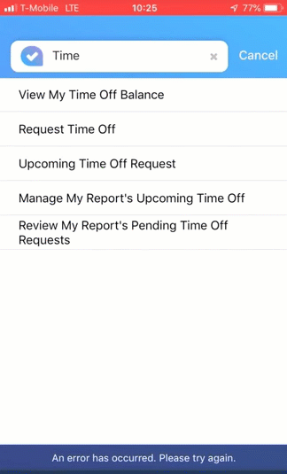
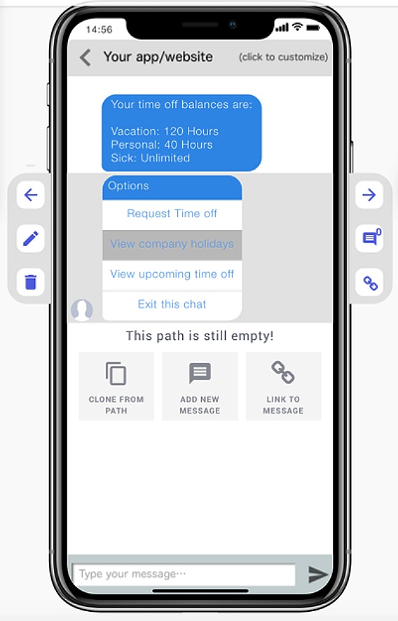
The original mobile chat bot for requesting time off.
background
As mobile chatbots emerged as a new self-service interaction model, conversational interfaces began to reshape the digital landscape. ADP’s Innovation Business Unit, Lifion, set out to explore how Human Capital Management (HCM) services—particularly those used by employees and managers—could be delivered through a chatbot experience.
Within a few months, the Product, UX, and Mobile Engineering teams designed and built a mobile chatbot supporting several services, including employee surveys, directory management, and time-off requests with manager approval.
Despite the rapid progress, early internal use revealed shortcomings. When we began using the product ourselves—as employees and managers—the experience did not meet expectations, exposing usability gaps and limitations in how conversational workflows had been designed.
My Role
UX Designer & Consultant
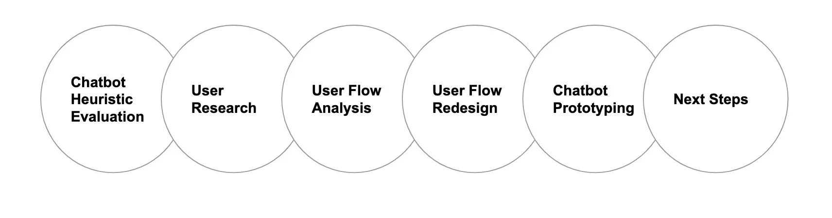
Scope of work & Design proces
Redesign the current chatbot experience for employees to request time off from their phone based on user feedback and in an attempt to better meet current chatbot expectations.
Heuristic Evaluation of current chatbot
Having got hold of a good set of chatbot heuristics at the UXPA 2018 conference, I resorted to using them to evaluate a the current Chatbot experience we had built for employees requesting Time Off.
Results from the Heuristic Evaluation showed that we hit a low against best practices with a total of 17/40, the breakdown was as follows;
Establishes a consistent language and tone of voice 2/5
Provides users with the right info to avoid mistakes and multi steps 2/5
Shows third party sites or content in a modal on top of the chat UI vs. external links 1/5
Uses ‘silence’ to provide realistic ‘thinking’ time (...) 3/5
Provides a good mix of UI uses; buttons, tiles, emoji etc.. in chat 3/5
Offers ‘skip’ options 2/5
Offer ‘go back’ option 2/5
Provides a clear indication to the user that the chat has ended 2/5
user research & Analysis
We carried out some user research with the current Chatbot. The following describes the study and key insights.
Hypothesis
Users find it easier to submit and accept time off requests on desktop (rather than the current mobile chatbot).
Goal
Increase mobile's Happiness, Adoption and Task Success (HEART) for Time Off Request.
Participants and Method
Online survey sent out to various employees at the local NY office who had filed time off request in the last 14 days using both desktop and mobile chatbot.
Findings
From the responses, we assumed that people are willing to give mobile a chance, implying that adoption is possible.
Survey Responses;
16 Responses.
Overall Responses Average; respondents are indifferent between mobile than desktop.
Key Opportunities sighted;
Streamline the UI, reliability and response times.
Adoption may be impacted due to function discovery within the app. This may be mitigated through the integration of feature onboarding.
Users may assume that a complex task may not be harder to complete on mobile especially via a chatbot.
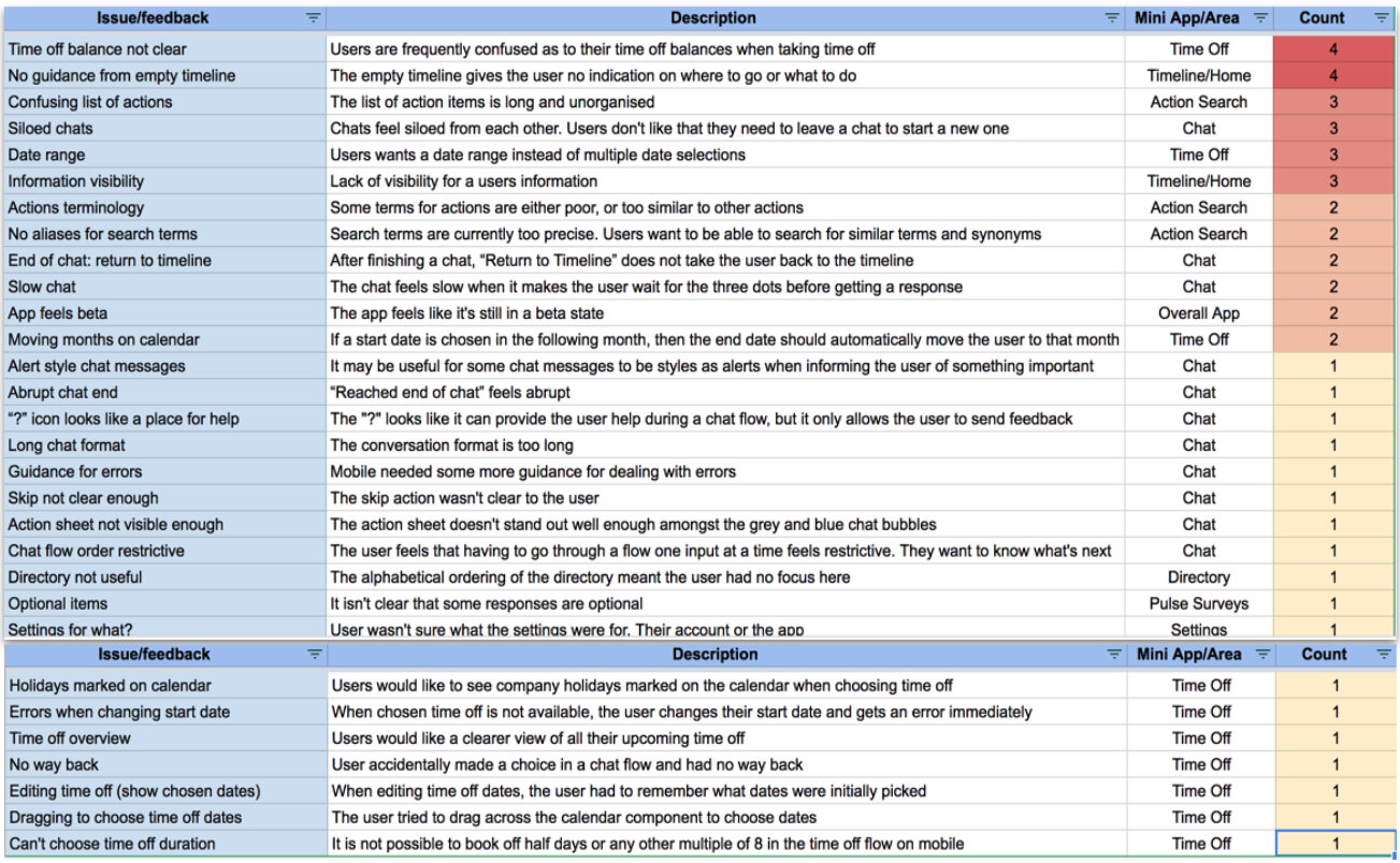
We combined the results from the Heuristic Evaluation and those from the user research and came up with a list of issues and prioritized these based on the count, that is, the number of mentions and/or occurrences. We then formed a plan with the Product and Development team to schedule appropriate redesign, fixes and future enhancements.
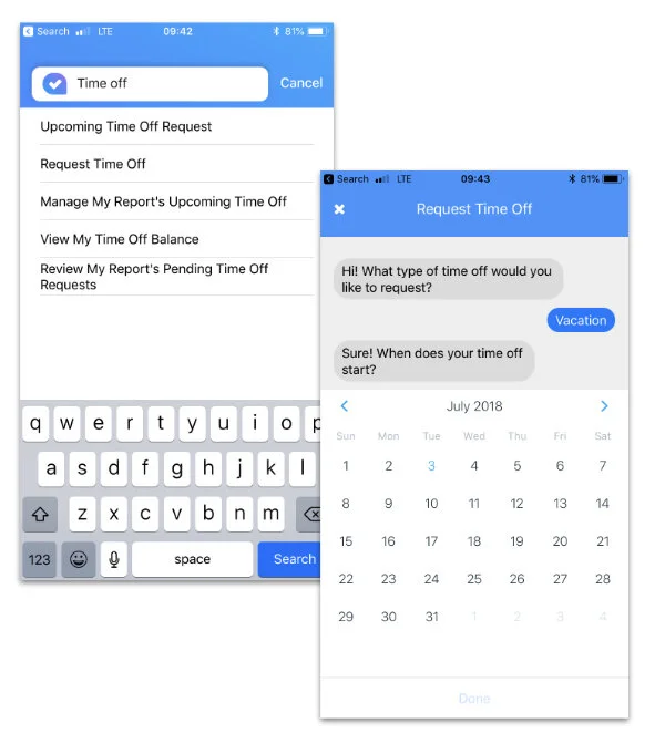
Review of the current chatbot User Flow
We analyzed the original user flow that was used by developers to build the first version of the Chatbot. We found a number of issues resulting which then reflected into the current Chatbot experience. The following are examples of the items we identified which then served as insights into creating a new template with ‘do’s’ and ‘don’ts’ guidelines when creating Chatbot flowcharts.
1. Wrong use of UI button list vs. lookup field.
2. Presenting what ‘bot says’ and offers in multi bubbles vs. one.
3. Logical decision points are visually treated same as the chat bubbles.
4. Multiple choice entry inputs required from user when these could be merged e.g. choosing entry and end date in one input.
5. No visual distinction between what ‘bots says’ and other interactive elements e.g. buttons or look up.
6. Long winded way of ending and exiting the chat.
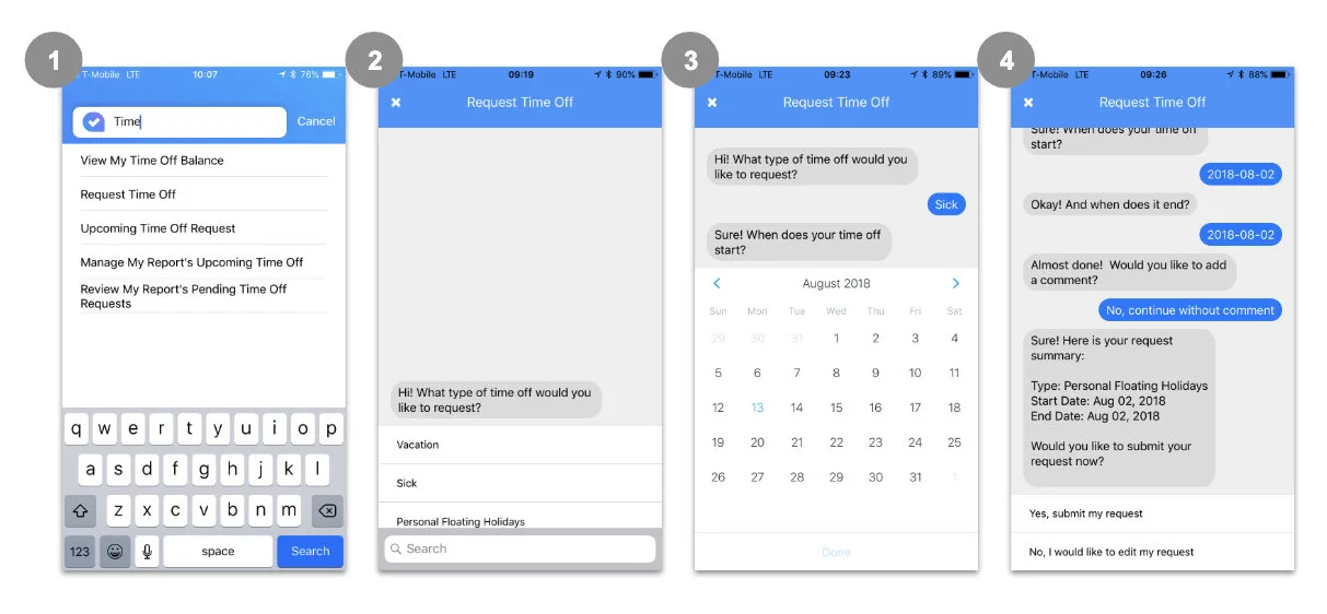
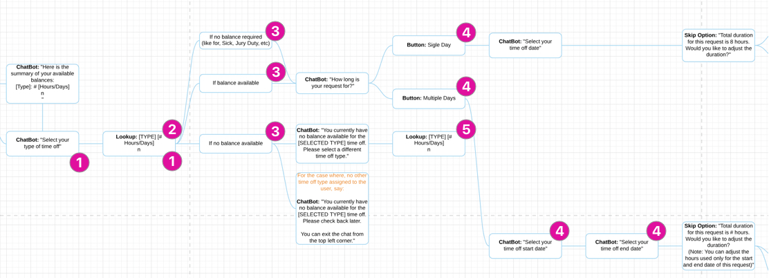
The New User Flow - A shorter and succinct path which provided the user with essential info (time off balances without asking for them) followed by a list of options including a clear ‘exit’.
a new mini design system for the chatbot
Template - Our Design Director first created a template for designers to use when creating any self service flow other than Time Off. It shows the various UI which could be used along the chat experience.
Prototyping before building
This time round we decided to create a prototype before diving into rebuilding the new Chatbot to ensure we get the desired experience.
There are a few online mobile chatbot tools; Botframe, Botmock and Botsociety. Botframe is pretty basic and while the other two are more robust, they each have their limitations. Both Botmock and Botsociety offer video output but only Botsociety offers an interactive prototype. While both Botmock and Botsociety have limited CTAs, Botmock doesn’t allow inflow editing (as see in image on the right).
I redesigned the Time Off Request flow using Botsociety. It allowed me to create all paths for each type of Time Off. It also allowed me to mark where options can be null e.g. ‘no upcoming time off’.
Next Steps…
The team decided to do more discovery research, to understand the aptitudes of client company users towards mobile chat vs. mobile app and desktop. Given the diversity of our client user base, our hypothesis was such that we would still need to offer the same types of HCM services, through other ‘classical’ channels that is, desktop and mobile app.